Introduction: The "Commodity Trap" in the Indian Digital Economy
Thousands of ambitious entrepreneurs across India launch innovative businesses every month. They develop exceptional products, offer competitive pricing, and build hardworking teams. Yet, when prospective clients visit their digital platforms, the reaction is lukewarm. Prospective buyers question their legitimacy, haggle endlessly over price quotes, and frequently defect to established enterprise incumbents whose core product offerings may actually be inferior.
This widespread phenomenon is known as the "Commodity Trap." In the digital realm, customers do not judge your operational excellence by your factory floor, your software code, or your private balance sheet; they evaluate your credibility through the immediate prism of your visual identity, sensory typography, interface clarity, and emotional storytelling.
A landmark global economic study conducted by McKinsey & Company on The Business Value of Design tracked 300 publicly listed companies over five years and revealed that design-driven enterprises outperformed industry benchmark competitors by 2 to 1 in both revenue growth and total returns to shareholders. Superior design is not cosmetic decoration; it is a measurable multiplier of enterprise valuation, pricing power, and customer trust.
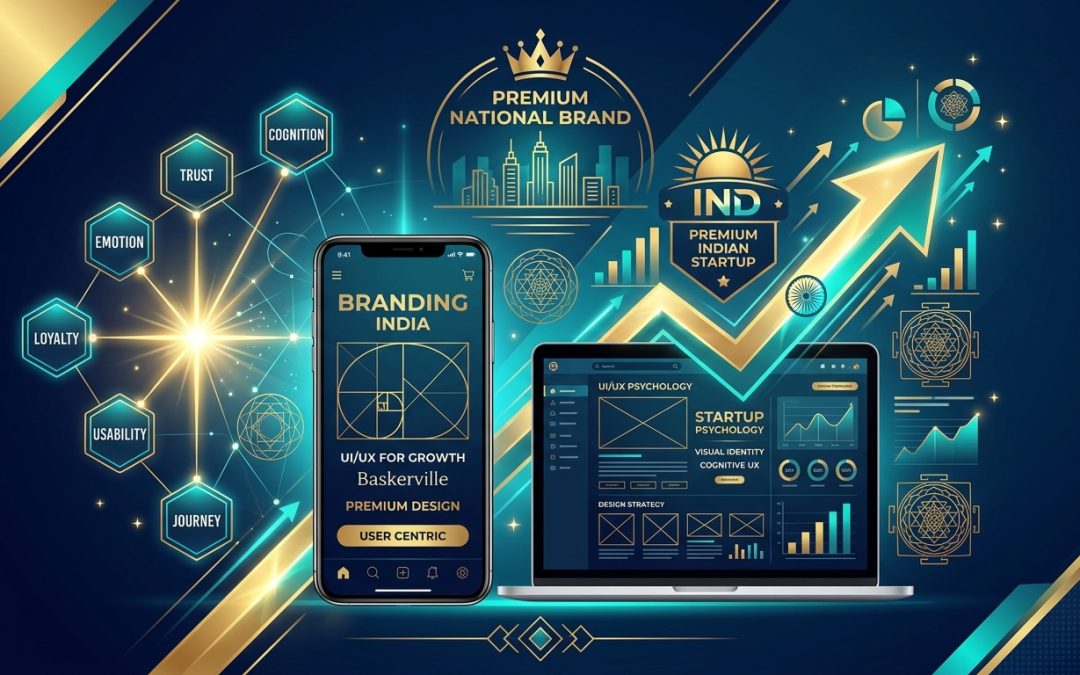
For Indian startups and regional enterprises in Kerala, Bengaluru, Mumbai, and Delhi, mastering the intersection of Brand Identity Architecture and Cognitive UI/UX Psychology is the definitive bridge separating a struggling local vendor from a premium national market leader. As Kerala's premier bespoke website design, branding, and digital growth agency, Nrootz explores how psychology-backed design transforms brand perception and drives commanding market authority.
Design Authority Truth: Pure text on a webpage cannot convey market leadership or command premium pricing. Modern digital dominance requires cognitive visual hierarchy, structured comparison tables, responsive brand diagrams, and meticulous typography that dismantle user hesitation.
Generic Commodity Business vs. Category-Defining Premium Brand Identity
Examine how a standard template-based website compares against a premium brand architecture engineered for psychological impact:
| Brand Element | Generic Commodity Business (Template Built) | Premium Category-Defining Brand (Bespoke) |
| Market Positioning | Competes solely on price ("Lowest rates in Kerala") | Competes on definitive outcomes, prestige, and high ROI |
| Visual Language & Color | Chaotic color schemes; uncalibrated stock imagery | Intentional 60-30-10 color psychology; custom branded assets |
| Typography Hierarchy | Default system fonts or mismatched display typefaces | Editorial font pairing calibrated for optimal reading cadence |
| Cognitive Usability | High cognitive load; cluttered layouts and friction | Subconscious ease; effortless linear narrative flow |
| Perceived Value | Risky, unvetted regional vendor | Established, authoritative national institution |
| Commercial Impact | Client margin erosion; difficult closing cycles | Command 2x to 4x higher pricing with shorter sales velocity |
The 5-Layer Brand & Cognitive UX Hierarchy
Transforming user perception from initial curiosity into unshakeable brand loyalty requires orchestrating digital interfaces across five interdependent psychological tiers:
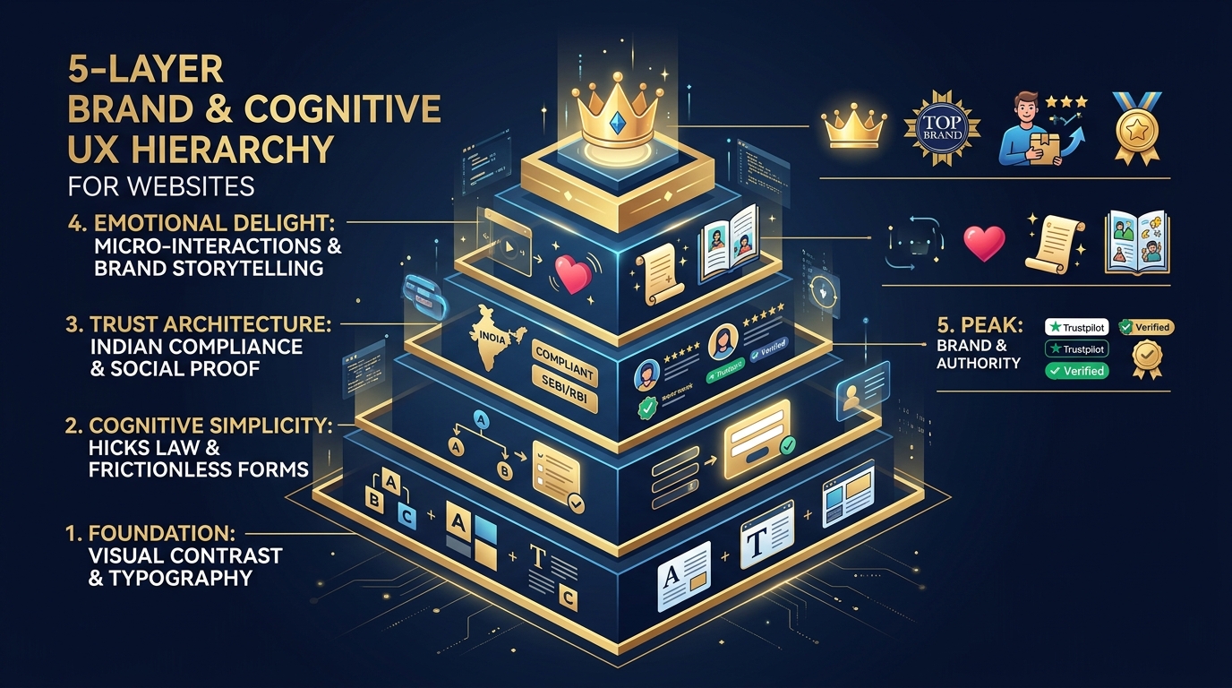
The 5-Layer Brand & Cognitive UX Hierarchy: building upward from visual contrast and typography foundations to cognitive simplicity, trust architecture, emotional delight, and market leadership.
1. Foundation: Visual Contrast, Grid Discipline & Typography
Human subconscious perception evaluates visual aesthetics in less than 50 milliseconds. Long before a user comprehends your copy, their visual cortex forms an emotional judgment about your competence based on grid discipline and typography.
Foundational principles codified by the Interaction Design Foundation (IxDF) on Visual Design Principles emphasize the mathematical balance of whitespace, golden ratios, and typographic hierarchy:
- The 60-30-10 Color Architecture: 60% dominant neutral background (clean slate or warm off-white), 30% structural secondary tone (deep corporate indigo or obsidian), and 10% high-contrast intentional accent (emerald green, vibrant electric cyan, or warm amber gold) strictly reserved for primary conversion actions.
- Typographic Cadence: Eliminate generic default fonts like Arial or basic Open Source templates. Pair an authoritative, editorial serif or modern geometric sans-serif for headings (e.g., Plus Jakarta Sans, Syne, Cabinet Grotesk) with a readable, high-legibility body typeface (e.g., Inter, Satoshi). Maintain strict baseline grids and line-height ratios between 1.6 and 1.8.
2. Cognitive Simplicity: Eliminating Mental Friction
The human brain is fundamentally an energy-conservation mechanism. When an interface forces users to think, interpret complicated jargon, or decipher confusing multi-layered menus, cognitive friction spikes and visitors abandon the session.
Extensive usability studies published by the Nielsen Norman Group (NN/g) on Minimizing Cognitive Load confirm that reducing visual choices and simplifying decision trees directly multiplies conversion velocity:
- Hick’s Law Application: The time it takes to make a decision increases logarithmically with the number and complexity of choices. Replace sprawling mega-menus containing 40 links with focused, intent-based journeys that guide users into clear primary pathways.
- Miller’s Law Chunking: The average human working memory can hold approximately 7 (plus or minus 2) chunks of information. Break complex service architectures, enterprise software features, or checkout funnels into bite-sized, digestible cards rather than continuous walls of text.
3. Trust Architecture: Engineering Safety for Indian Decision-Makers
Due to the proliferation of online scams, fly-by-night operators, and low-quality digital agencies across India, skepticism is the default operating state of Indian B2B buyers and consumers. A premium brand intentionally dismantles skepticism through systematic trust signals:
- Verifiable Regulatory Badges: Display official GSTIN verification, DPIIT Startup India registration, ISO certifications, and RBI/SEBI compliance badges prominently near high-stake decision points.
- Identified Human Leadership: Commodity websites hide behind anonymous generic "About Us" stock photography. Premium brands feature authentic portraits, verified LinkedIn profiles, and thought leadership commentary from their founders and senior technical leaders.
- Contextual Micro-Copy: Place reassuring micro-copy adjacent to every form field and CTA button (e.g., "We respect your privacy. 100% Confidential NDA Assured. No spam calls.").
4. Emotional Delight: Subconscious Micro-Interactions
The difference between a functional website and an unforgettable digital experience lies in the nuanced realm of micro-interactions. These subtle sensory feedbacks reassure the user that the system is responsive, dynamic, and crafted with obsession:
- Haptic and Smooth Transitions: Gentle button state hover expansions, fluid accordion expansions, and smooth parallax depth layers communicate engineering sophistication.
- Visual Progress Indicators: In multi-step onboarding forms, interactive progress bars and animated checkmarks reward user completion, tapping into the psychological Goal-Gradient Effect (users accelerate effort as they approach completion).
5. Peak: Category Authority & Emotional Brand Loyalty
At the apex of the hierarchy, your digital presence transitions from an informative brochure to an industry institution. When an Indian business reaches this level, clients do not compare proposals; they demand to work with the definitive market leader.
- Proprietary Terminology & Frameworks: Rather than selling generic "SEO services" or "Web design," create named intellectual property (e.g., Nrootz’s "Omnichannel Growth Flywheel" or "7-Pillar GEO Scorecard"). Named frameworks signal proprietary mastery.
- Documented Enterprise Impact Studies: Replace vague one-line reviews with data-rich case studies detailing client baselines, technical methodology interventions, and audited revenue outcomes.
Cognitive UX Laws and Measurable Conversion Impact in India
How do psychological design principles translate into concrete commercial performance? Review these measured conversion lifts from Nrootz’s UX optimization audits:
| Psychological Law | Core UX Principle | Practical Implementation | Observed Conversion Lift |
| Hick's Law | Decision time scales with choice complexity | Reduced header links from 14 to 4; single high-contrast primary CTA | +38% Inquiry Completion |
| Von Restorff Effect | Distinct visual items are remembered and clicked | Highlighted target "Recommended" enterprise pricing tier with visual badge | +52% Tier Selection |
| Fitts's Law | Target acquisition depends on size and distance | Sticky bottom mobile navigation with oversized 48px touch targets | +44% Mobile Clicks |
| Serial Position Effect | First and last items in a series are recalled best | Positioned most impactful ROI metrics in position #1 and final summary #5 | +29% Retention Recall |
| Social Proof Anchoring | Users look to group consensus to validate safety | Placed authentic Indian client logos directly beneath hero value statement | +34% ATF Engagement |
Designing for Diverse Indian User Personas (Tier-1 vs. Tier-2/3)
A fatal mistake made by Westernized design templates is assuming all Indian users navigate digital interfaces identically. A truly national brand adapts its UX psychology across distinct regional dynamics:
- Bandwidth Consciousness & Performance: While 5G adoption is booming in metros like Bengaluru and Delhi, users in tier-2 and tier-3 towns often encounter fluctuating 4G networks. Bloated web templates with 10MB of uncompressed background video create frustration. Lightweight, custom-coded web architectures deliver lightning-fast render times regardless of geographic connectivity.
- Vernacular Semantic Cues: Even when browsing English-language business sites, Indian users appreciate clear cultural cues—such as Rupee symbols (₹) rendered natively with correct Indian numbering systems (Lakhs and Crores rather than Millions and Billions), local regional case references, and WhatsApp chat accessibility.
Why Partner with Nrootz for Brand & UI/UX Transformation
At Nrootz, we reject cookie-cutter WordPress themes and superficial graphic design gimmicks. We approach digital branding and web development as an exact science of commercial persuasion, cognitive psychology, and bespoke technical engineering.
From establishing commanding visual identities and custom typography palettes to engineering custom-coded, ultra-fast websites that dominate Google search and maximize conversion rates, our team partners with forward-thinking businesses across Kerala and India to transform ambitious startups into respected national industry leaders.
Frequently Asked Questions (FAQ)
How does UI/UX design directly impact a company's ability to command higher pricing?
Design creates immediate psychological anchoring. When prospective clients encounter a bespoke, aesthetically disciplined interface with clear visual hierarchy, frictionless interactions, and zero cognitive drag, they subconsciously attribute premium craftsmanship, reliability, and enterprise stability to the organization. Businesses with premium digital brand identities routinely close deals at 2x to 4x higher price points than competitors using generic templates.
What is cognitive load and why is it critical for Indian business websites?
Cognitive load refers to the total amount of mental energy and processing power required for a user to understand an interface. When websites feature cluttered layouts, wall-to-wall text, ambiguous buttons, or complicated navigation structures, cognitive overload occurs, prompting the visitor to immediately bounce. Streamlining visual choices and organizing information into scannable chunks dramatically reduces friction and accelerates conversion.
Why do off-the-shelf website themes fail to build premium brand authority?
Marketplace themes are designed to appeal to everyone generically, resulting in bloated CSS/JS files, sluggish load speeds, rigid structural constraints, and visual predictability. Discerning corporate clients and modern consumers instantly recognize template designs, which subtly signals a lack of investment and amateur operational scale. Custom hand-coded websites deliver bespoke individuality, flawless speed, and unmatched authority.
What role does color psychology play in establishing digital trust in India?
Colors carry profound psychological associations. Deep corporate blues and teals signify security, technical stability, and institutional authority; emerald greens evoke growth, verification, and prosperity; vibrant amber tones draw decisive conversion focus without triggering alarm. Adhering to a disciplined 60-30-10 color balance prevents visual fatigue and directs user focus directly toward high-value conversion actions.
How long does a comprehensive brand identity and UI/UX website overhaul typically take?
A strategic digital brand transformation—encompassing market positioning research, visual identity design, cognitive wireframing, custom frontend development, and rigorous conversion testing—typically takes between 4 to 8 weeks depending on the organizational scope and technical depth.